
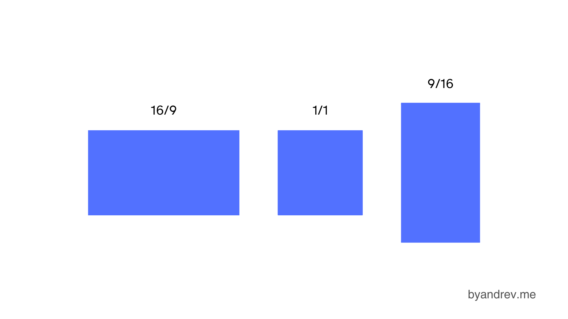
Some of the most well-known aspect ratios are as follows:
In CSS
To define the aspect ratio of an element, you should do the following:
selector {
    aspect-ratio: width / height;
}
Keeping the aspect ratio on an image
.image {
    width: 100%;
    aspect-ratio: 16 / 9;
}
Accessibility
Using aspect ratio helps us avoid layout shift, which is a very annoying issue that often happens on websites. Layout shift refers to the unexpected movement of web content when elements are still loading.
Here is an example without the use of aspect ratio and another with this property. When the button is not used, it moves when the image loads. This is known as layout shift.
I hope this article has been useful in helping you better understand the concept of aspect ratio in CSS and that you will use it in your designs!